|
The First System: The New York Box
We used the 15 minute charts for the first system we tested.
This is what we did:
1. We drew a horizontal line across the lowest point that the currency pair reached between 12:00am (midnight) and 7:00am, Eastern Time.
2. We drew a horizontal line across the highest point that the currency pair reached between 12:00am (midnight) and 7:00am, Eastern Time.
3. If the currency pair fell and closed below this box (what I call the New York Box), on Friday, then we sold the currency pair. This move below the box could happen on the first candle after the NFP report (the candle that closed at 8:45am EST), or it could happen all the way near the close of trading on Friday.
4. If the currency pair rose and closed above this box (what I call the New York Box), on Friday, then we bought the currency pair. This move above the box could happen on the first candle after the NFP report (the candle that closed at 8:45am EST), or it could happen all the way near the close of trading on Friday.
5. We held the trade for the entire month and marked what the maximum amount of pips gained could be.
6. We placed a stop loss 100 pips beyond the opposite side of the box. If this stop loss was hit, we reversed and traded in the opposite direction. Our new stop loss would be 1 pip beyond the opposite side of the original Non Farm Payroll day box, and for our profit target, we would hold the trade for the entire month and see how many pips we could get.
Let’s look at some examples.
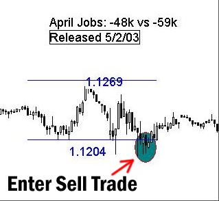
Example #1: Taking a Sell Trade
In the example below, you can see blue horizontal lines that “sandwich” the candles. I call these lines the New York Box. This means that between 12:00am (midnight) and 7:00am, Eastern Time, on May 2, 2003, the highest point the EUR/USD reached was 1.1269. The lowest point was 1.1204.
This means that the first candle you use to create the box is the candle that starts forming at 12:00 midnight. The last candle you use is the candle that begins forming at 6:45am (because it closes at 7:00am).
In Figure 1, the trade entry is approximately 1.1195. The stop loss goes 100 pips beyond the opposite side of the box, or 1.1369.
Figure 1. The currency pair (the EUR/USD) drops below the box on the 15 minute chart, and then closes below the box. This creates a sell trade.
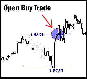
Example #2: Taking a Buy Trade
In the example below, you can see blue horizontal lines, our New York Box. Between 12:00am (midnight) and 7:00am, Eastern Time, on September 5, 2003 the highest point the GBP/USD reached was 1.5861. The lowest point was 1.5789.
If the pair broke outside of the New York Box after 7:00am but BEFORE the Non Farm Payroll report was released, we took the trade anyway.
In this example, the stop loss would go at 1.5689, which is 100 pips below the bottom side of the box.
To complete our testing, we then moved forward in time on our charts to see how much profit we would get or, alternatively, if we were stopped out and then had to open a trade in the opposite direction.
Figure 2. The currency pair (the GBP/USD) rises above the box on the 15 minute chart, and then closes above the box. This creates a buy trade.
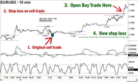
Example #3: The Reversal Trade
The image below is not going to be completely legible for you, so you’ll need to access either the www.robbooker.com/NFP Web site or the CD in order to get a better view of it.
This is a bigger picture view of the EUR/USD for the Non Farm Payroll trade shown in example #1.
In the attached example, we take a sell trade (position #1) but then it rises up and hits our stop loss (position #2). This means we open a buy trade (position #3) and then set our stop loss to 1 pip below the bottom of the original NFP box (position #4).
We took screen shots of the 15 minute and the 1 hour charts from three currency pairs, for every NFP report move since December 2002. An example of a 1 hour chart is below (see next post).
Figure 3. We included the MACD-Histogram plus the Stochastic Oscillator in our examples so that you would have the option of using those indicators in our testing.
Looking at the 1 Hour Chart
The image below is not going to be completely legible for you, so you’ll need to access either the www.robbooker.com/NFP Web site or the CD in order to get a better view of it.
This is a bigger picture view of the EUR/USD for the Non Farm Payroll trade shown in example #1, the Non Farm Payroll trade from April 2003.
The 1 hour charts don’t show the entire month – that would make the candles and the prices so small that they would be impossible to read. But they do give us an idea, in nearly every chart, of whether the original trade or reversal would be profitable.
Figure 4. This chart identifies the buy trade we took in Example #3, and follows the trade a few more days into the future.

|