As mentioned before, charts are primary tools to analyze the currency market in real-time and every currency trader should use them. There are three main types of forex charts: candelestick charts, bar charts and line charts.
Most commonly used among currency traders are candlestick charts because they are much more visually appealing than a simple line or bar chart.
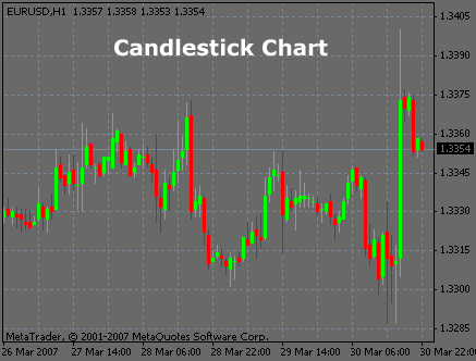
1) Candlestick chart
There are 4 components needed to construct a candlestick, the Open, Close, High and Low price for a given period. Looking to the below examples, the high is marked by the top of the upper shadow, the low is marked by the bottom of the lower shadow representing the high/low price extremes for the period.
The Body of the candlestick is called the real body, and represents the range between the open and closing prices. If the close price is lower than the open price, the body will be black, if the close price is higher than the open price, the body will be filled-in.
The white candlestick is called BULLISH (Close price > Open price indicates Buying Pressure), the black candlestick is called BEARISH (Close price<Open Price indicates Selling Pressure)
Example of a candelestick chart
2) Bar chart
The bar chart is made up of four parts components: open, high, low, and close price for a given period.
This type of chart is not very popular in currency trading.
Example of a bar chart
3) Line chart
A line chart uses only the closing prices to form a line and present much less useful information than a candlestick or bar chart. Therefore, they are not used when trading forex.